

 Click it and Unblock the Notifications

Latest Updates
-
 Amitabh Bachchan's Misunderstood Blog Sparked Concern, But His Real Medical Battles Define Resilience
 -
 Jaipur Ranks 6th Among World's Happiest Cities 2026: The Culture Behind The Joy
 -
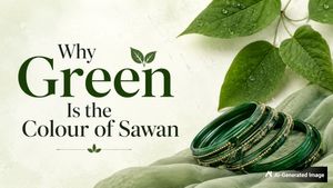 Why Green Is the Colour of Sawan: History, Symbolism, and Styling Tips
 -
 Legionnaires' Disease Outbreak: What It Is, Symptoms, Causes, And Prevention Explained
 -
 Ananya Panday's Gaurav Gupta Couture Featured 12,000 Pearls, 2,600 Petals And A Celestial Love Story
 -
 Kharchi Puja 2026: Tripura's Ancient Festival Where The Heads Of Fourteen Deities Are Worshipped
 -
 World Brain Day 2026: How Quality Sleep Helps Safeguard Your Brain Health
 -
 National Mango Day 2026: Why Mango Is Called The 'King Of Fruits' And What Sets It Apart
 -
 Is It Monsoon Hair Fall Or Something More Serious? How To Tell
 -
 World Brain Day 2026: Date, History, Theme, and Why It Matters


Pantone Colour Of The Year 2022 Very Peri - 7 Interesting Ways To Incorporate It In Your Home

Pantone Colour of the Year is an annual ritual that the Pantone company introduces in an attempt to revitalize the design industry. We then see the shade reflected in the fashion, beauty, technology and interior design industry. The Pantone colour of the year 2022, is a bold combination of blue-violet and periwinkle called 'Very Peri'. The colour is meant to showcase joy, creativity and imagination by incorporating the shade into furniture, accessories, paints and all possible interior elements.
Here are some ideas to show you how to decorate your home with Pantone Colour of the Year 2022 - Very Peri.

1. Accessories in complementing tones
There are multiple ways to experiment with a Very Peri colour scheme. You could start with small accessories like a vase that adds a touch of modernity to your house, a coffee table book with a purple cover, a periwinkle shade table lamp and violet-tinted glassware. Experience the smaller changes, to consider making periwinkle a bigger part of your colour scheme in future.

2. Very Peri throw blankets
A throw blanket serves as a perfect accent piece for your interior design scheme. You can use a bright Very Peri throw blanket in your subtle room to liven up your space. You could drape it over the couch or throw it across your bed to give an attractive touch.

3. Periwinkle in its natural form
Considering the latest colour trend of the year and the love for plants, do not forget to soften up your space with a pot of periwinkle flowers. This is the easiest and most effective way to bring the shade of Very Peri into your space. Also, consider faux flowers in case you want to enjoy them for a long time.

4. Paint with shades of Very Peri
Display carefree confidence by going bold on your walls with the Pantone colour of the year. Very Peri is a vibrant shade and could seem overwhelming if used all over. You could play around with variant shades or go lighter with similar blue-tinted purples. You could create an accent wall for smaller areas and experiment with the tone on your window shutter or front doors to give it an adventurous look.

5. Very Peri inspired art
A beautiful piece of art that is carefully chosen will add colours and shades that will make your space attractive. Rather than painting an entire wall with the shade of Very-peri, you can opt for wall art with gentle splashes of periwinkle. This will help to break up your blank wall by adding texture and depth to the room.

6. Statement-making accents
Very Peri is a beautiful shade that can give an otherwise neutral space a pop of colour. This shade can bring out a statement-making accent by highlighting a purple upholstered armchair, vibrant coloured curtains and pillows in shades of violet or a royal rug in tones of periwinkle. Using the right accents with Very Peri will help accentuate the home by adding personality.

7. Style your bedroom in Very Peri tones
The shade of Very Peri is both energetic and cosy to give a perfect look to the bedroom. Incorporate the shades using decorative pillows and throws to highlight the bed. Use soft and oversized comforters to add a welcoming and cosy touch to your room. Spread in the hues of periwinkle blue and violet-red undertone to your bedroom walls for a trendy look.
Image Credits: Pinterest.